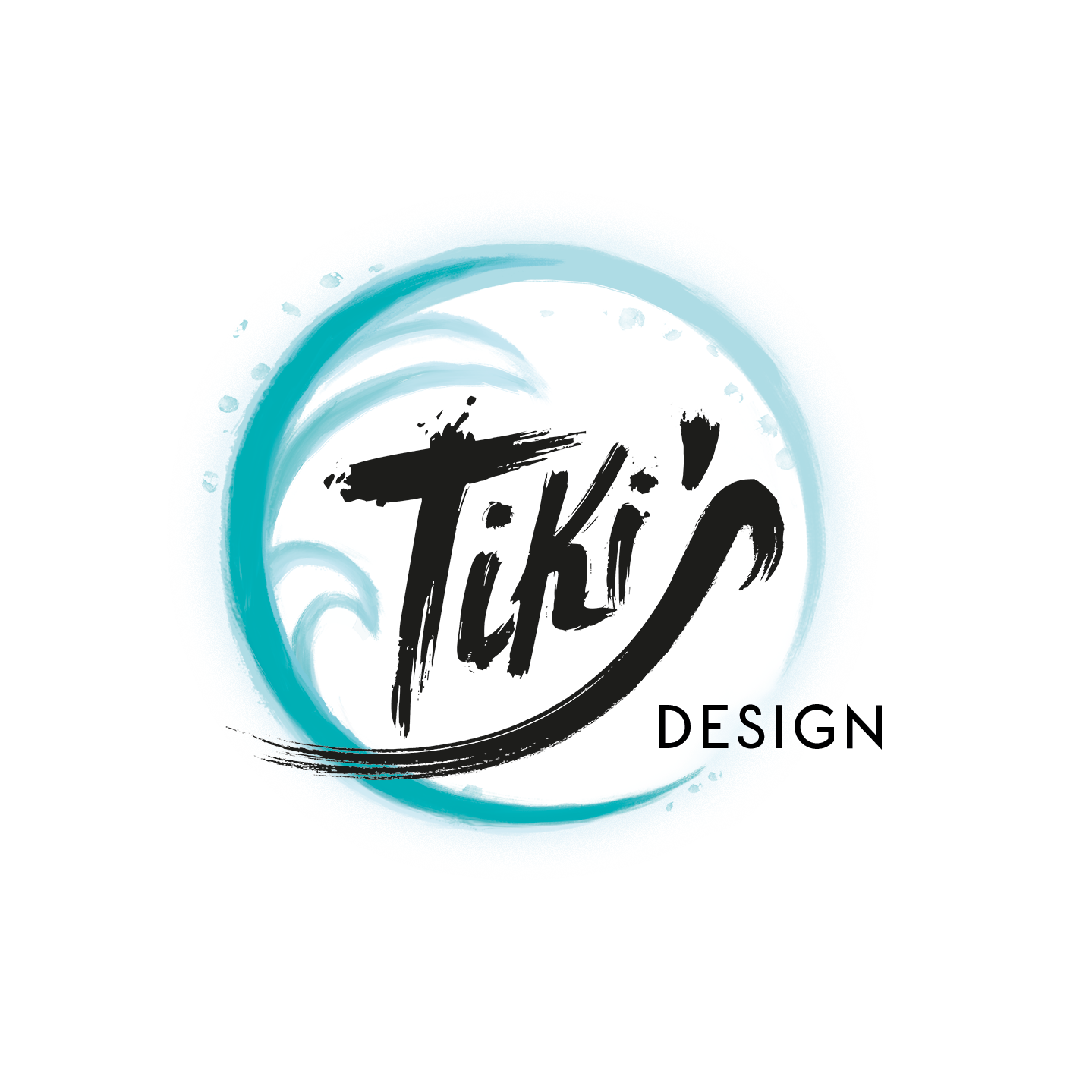


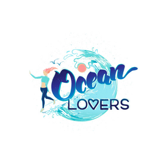
Project: This is a logo (logo'ésque illustration) I made for a young brand called Oceanlovers. They offer jewellery and accessories inspired by the sea and a surfer/yogi-lifestyle.
For the future of the brand they have versatile plans. So they wanted a design that communicates their connection to the ocean as well as a healthy, mindful (yoga-) lifestyle and general wanderlust.
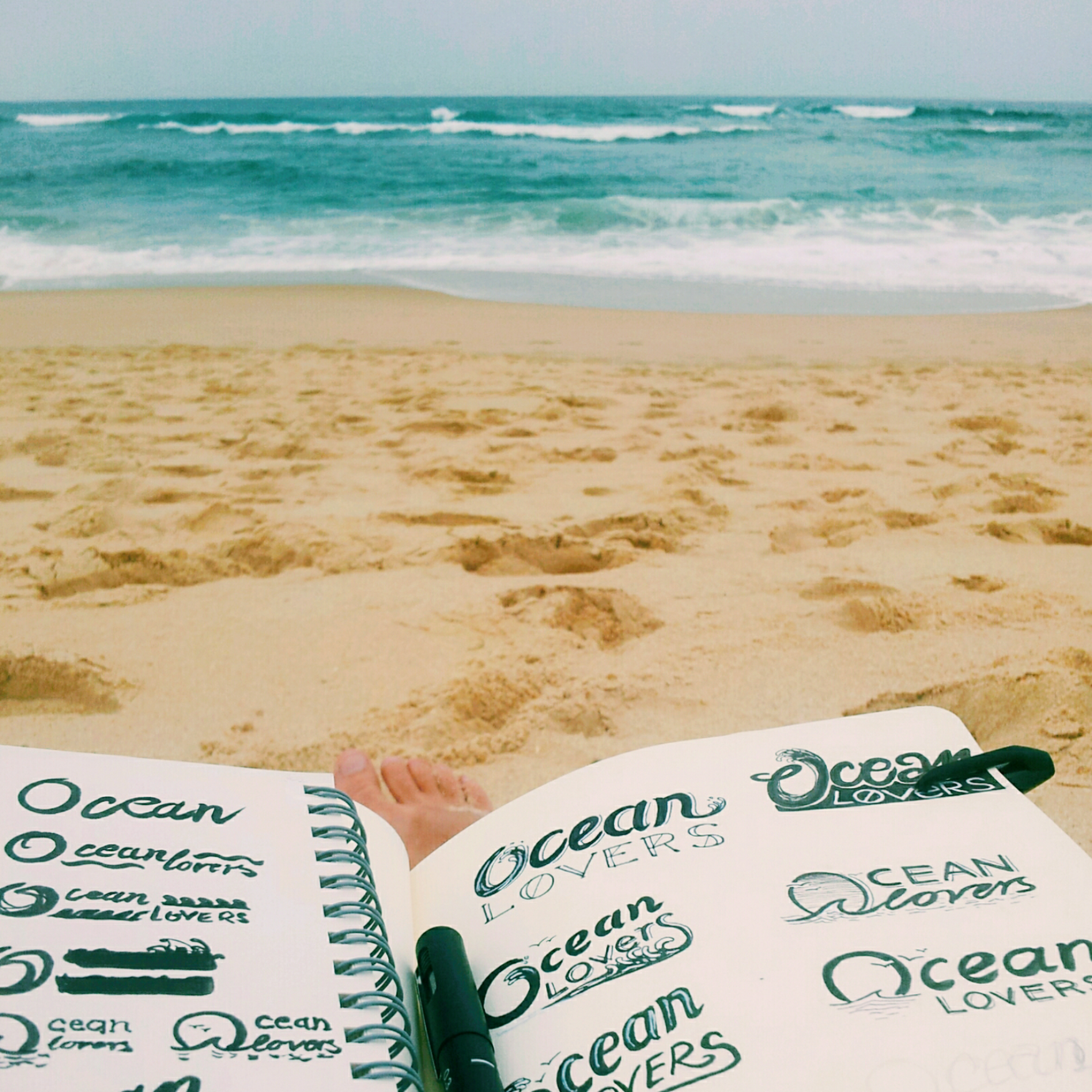
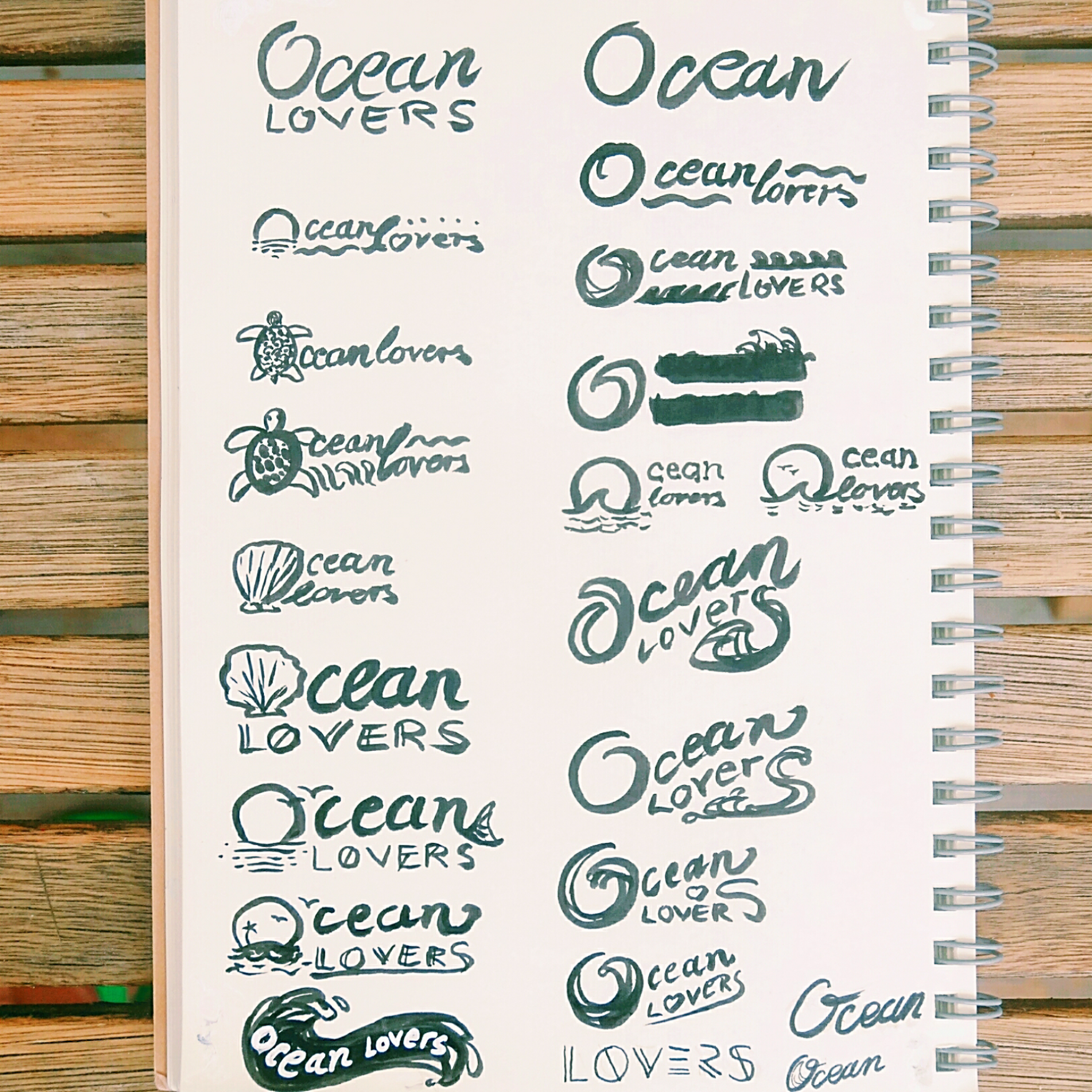
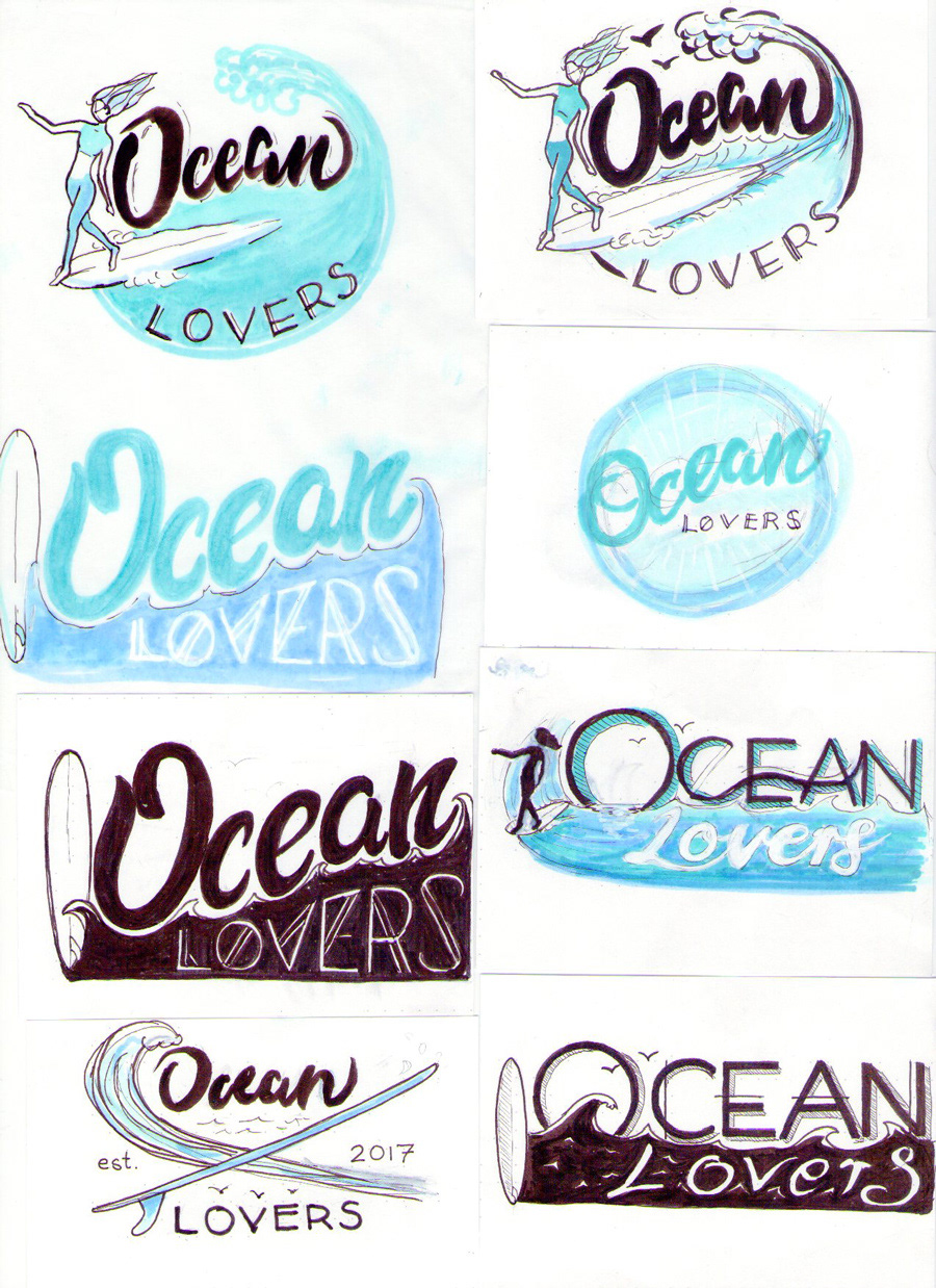
Feeling very much connected to their ideals and sharing many of their values, ideas for the design came very natural to me. The challenge began by choosing - out of many sketches - which design to elaborate further.
Originally we agreed on making a rather simple hand-lettering with subtle illustration elements, definitely including a wave of some sort. Later on the client also wished to include additional elements, like a longboard and a surfer girl, that make the target group even more obvious.
Originally we agreed on making a rather simple hand-lettering with subtle illustration elements, definitely including a wave of some sort. Later on the client also wished to include additional elements, like a longboard and a surfer girl, that make the target group even more obvious.
So the idea came up to develop a more illustrative logo, instead of just a hand-lettered word-mark.
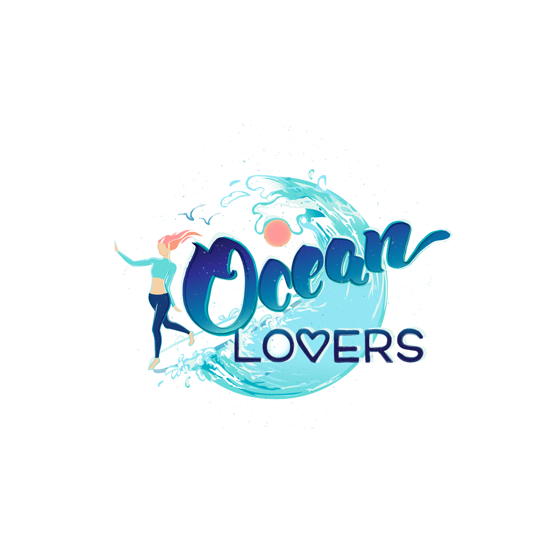
I tried my best to craft all elements together in a balanced way, using the round shape of the wave as a base to hold it all together. There's also a subtle indication of their affinity to the yoga culture. The light an coloured part of the wave-shape combined with the coloured sun-dot and the white space within the O of "Lovers" form a loose interpretation of the Yin-Yang symbol.
I tried my best to craft all elements together in a balanced way, using the round shape of the wave as a base to hold it all together. There's also a subtle indication of their affinity to the yoga culture. The light an coloured part of the wave-shape combined with the coloured sun-dot and the white space within the O of "Lovers" form a loose interpretation of the Yin-Yang symbol.
Client: oceanlovers-fashion.de
Format: logo illustration in various sizes, for the use on screens as well as potential print products and advertisements.
Tools: liner pens, marker pens, Adobe Illustrator, Adobe Photoshop

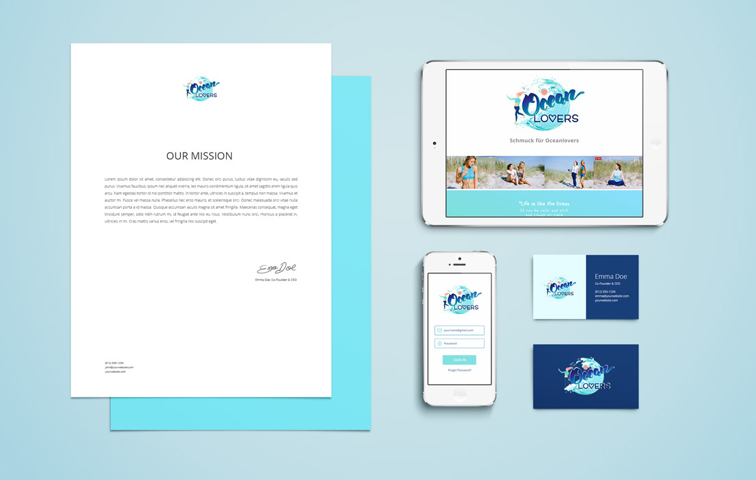
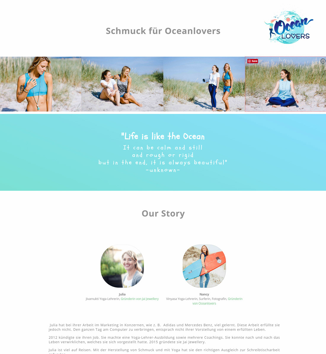
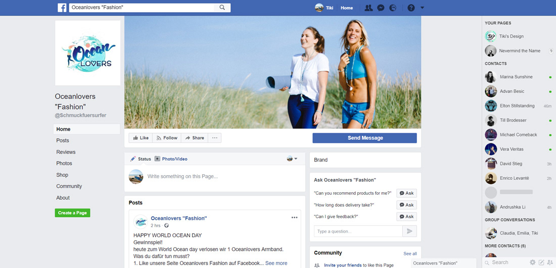
Web usage
examples of how they (want to) use it on their website and social media accounts
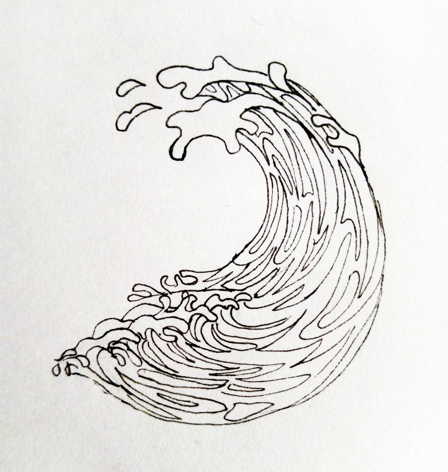
Larger Version
Since the logo became more of a brand illustration, I made a lager even more detailed version, that can be used for product prints or bigger ads for example.

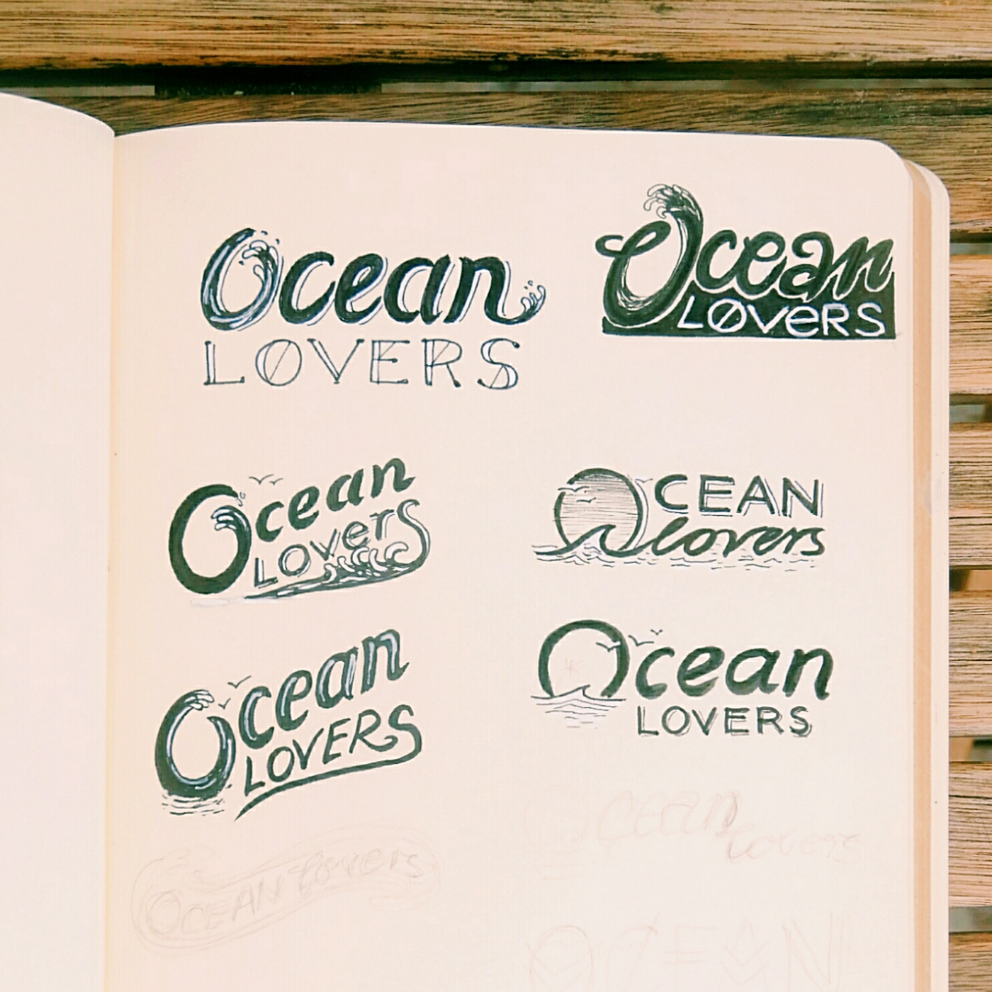
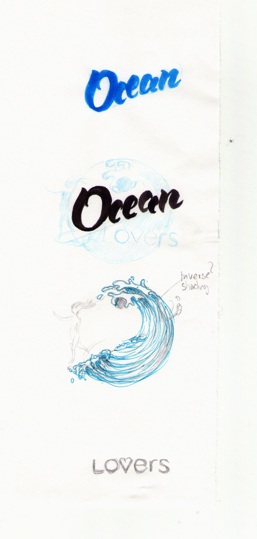
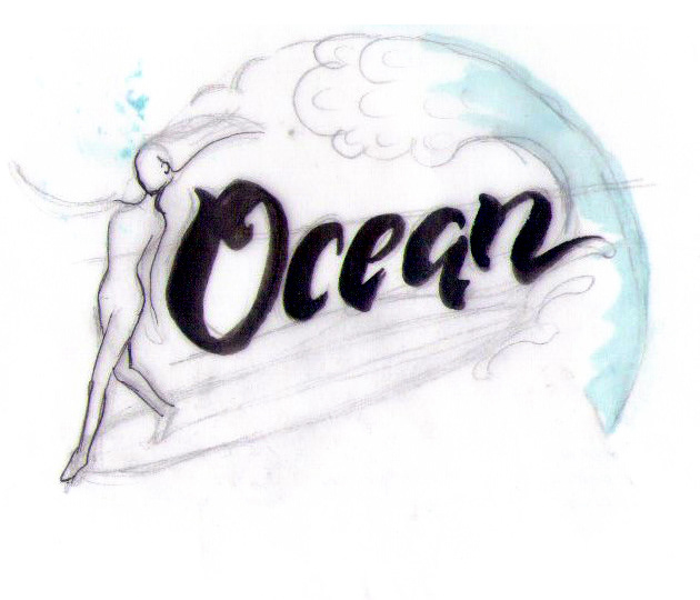
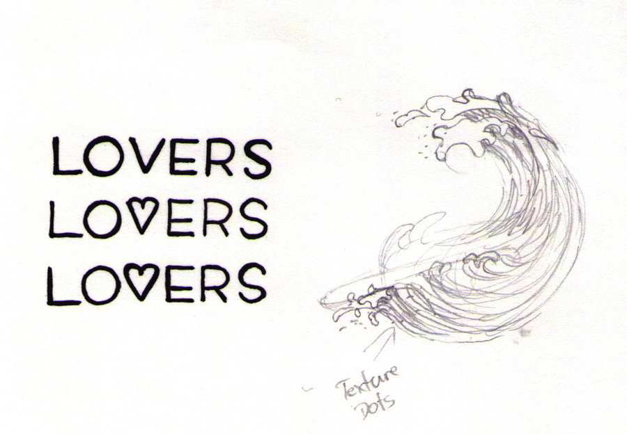
Sketches
...sketches sketches sketches...
Ideas and hand-drawn elements that I later digitised for the final design.
Ideas and hand-drawn elements that I later digitised for the final design.

Thanks for viewing!