
Project: This is a logo I made for a piano teacher in northern Netherlands. She is a young, yet experienced pianist originally from Mexico, who had just started to set up her own piano school in the city of Groningen, by the time we met.
Next to professionalism, ambition and sensible analysis of her student's abilities and needs, she puts a lot of her warm-hearted and playful personality into the lessons. With great pedagogical skills, this school aims at all ages and levels. The main focus, however, is on kids.
Therefore, the logo needed to speak to kids and parents looking for a professional, yet pedagogically experienced teacher. The client wished the logo to imply her dynamic and flexible teaching methods, while keeping a traditional feel. A well adjusted mix of colourful elements and rather classic looks needed to be created.
Therefore, the logo needed to speak to kids and parents looking for a professional, yet pedagogically experienced teacher. The client wished the logo to imply her dynamic and flexible teaching methods, while keeping a traditional feel. A well adjusted mix of colourful elements and rather classic looks needed to be created.
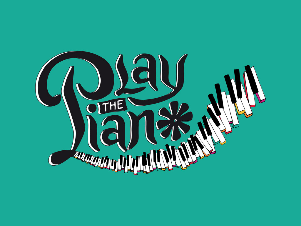
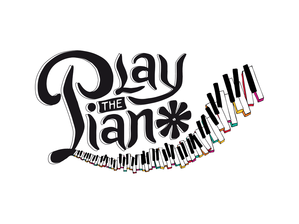
For the handmade lettering of the logotype, I adapted features of the notation system of piano instruments to create a typography that implies a traditional music education. To loosen up this appearance, I simply shifted the letters a bit to give it a relaxed and playful feeling.
The integration of a piano keyboard as a decorative element made a great opportunity to implement some more colours. Letting the keys "fly" apart underlined my clients focus on making piano lessons fun and accessible for people of all ages and skill levels.
Format: logotype in various sizes, icon for webpage tabs and profile images.
Tools: liner pens, Adobe Illustrator, Adobe Photoshop
Icon
For the icon, we chose to extract a few loosely flying piano keys, just like in the main logo. The client wished for an orange coloured background to resemble the Dutch monarchy's traditional colour. ("Oranje")


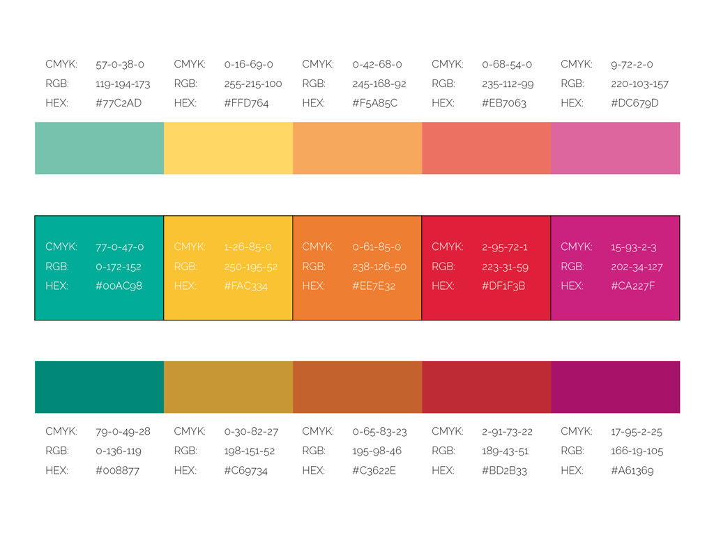
Colour System
Not just to underline the lively and playful approach of the teaching, but also to throw in a bit of the client's lovely personality and her Mexican roots, we chose for a rather vivid mix. Inspired by the colourful traditional fabrics of Mexico, I created this warm palette with a bit of tropical blue-green to round it off.
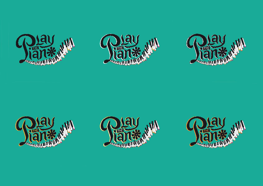
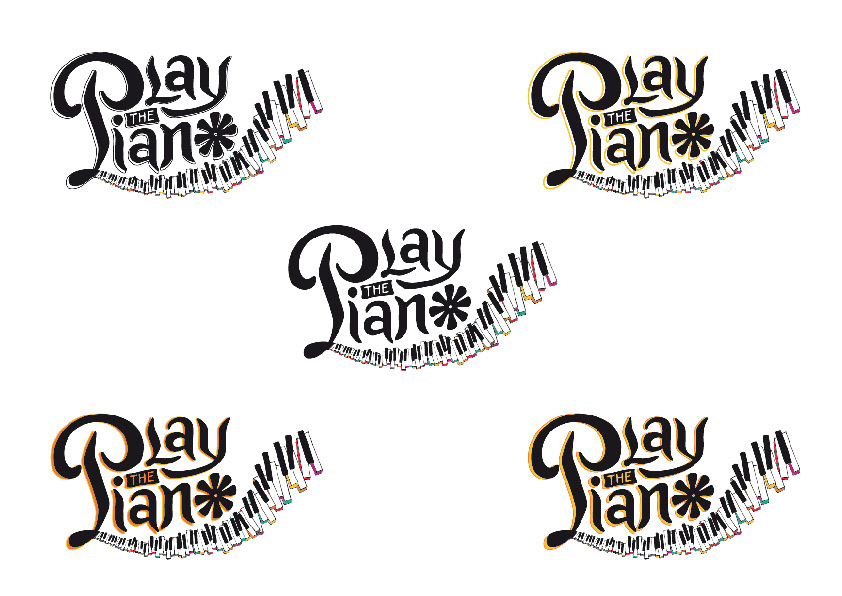
earlier versions
some variations in the shading, before we decided for the black and white version.
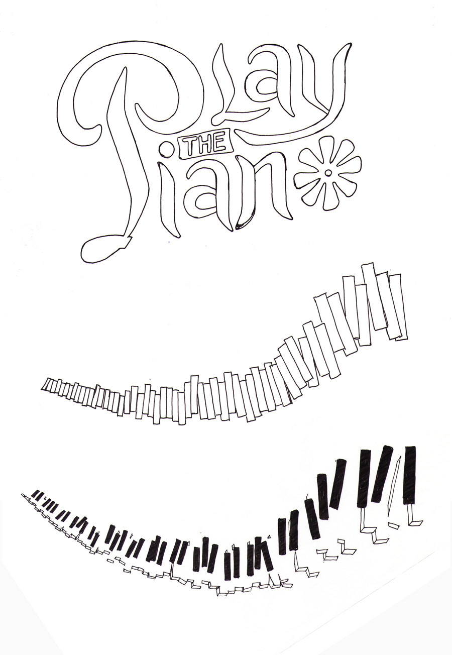
hand sketches
These are the original handmade elements and logotype, before they were edited and assembled in Illustrator.
Thank you for viewing!